Responsive Websites for SEO: Why Mobile-Friendly Design Matters in 2026
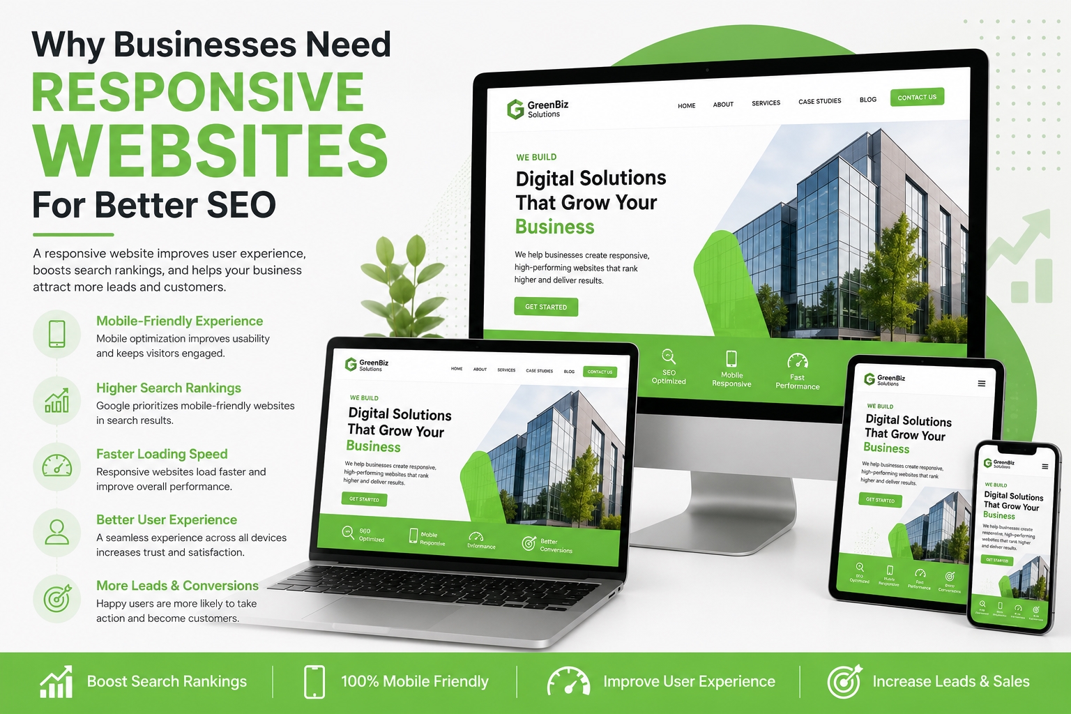
If your website isn’t mobile-friendly, you’re likely losing both visitors and potential customers. Today, responsive websites for SEO are no longer optional—they’re a necessity. With most online searches happening on smartphones and tablets, Google prioritizes websites that deliver an excellent experience across all devices.
A responsive website automatically adjusts its layout, images, and content to fit different screen sizes. This not only improves user experience but also helps your website rank higher in search engine results.
Whether you’re a startup, local business, or growing enterprise, investing in responsive web design is one of the smartest decisions you can make for long-term SEO success.
What Is a Responsive Website?
A responsive website is designed to adapt seamlessly to desktops, laptops, tablets, and mobile devices without requiring separate versions of the site.
Instead of forcing users to zoom in or scroll horizontally, responsive design ensures that every page is easy to navigate and visually appealing on any screen size.
Why Responsive Websites Matter for SEO
Google uses mobile-first indexing, meaning it primarily evaluates the mobile version of your website when determining search rankings.
If your website performs poorly on mobile devices, it may struggle to rank—even if the desktop version looks perfect.
Benefits of Responsive Websites for SEO
- Higher Google rankings
- Better user experience
- Faster page loading
- Lower bounce rates
- Increased engagement
- Higher conversion rates
- Easier website maintenance
A responsive website improves both customer satisfaction and search engine visibility.
1. Google Prioritizes Mobile-Friendly Websites
Google’s mobile-first indexing means responsive design directly affects your SEO performance.
If users have difficulty navigating your website on mobile devices, they are more likely to leave quickly. This sends negative engagement signals to Google, which can lower your rankings.
Mobile-Friendly Website SEO Benefits
- Better search visibility
- Improved indexing
- Higher click-through rates
- Better Core Web Vitals scores
Businesses with mobile-friendly websites have a competitive advantage in search results.
Why Does Google Prefer Responsive Websites?
Google prefers responsive websites because they provide a consistent experience across all devices, making it easier for users to access information quickly and efficiently.
2. Better User Experience Improves SEO
User experience has become one of Google’s most important ranking factors.
Visitors expect websites to load quickly, display properly, and be easy to navigate regardless of the device they’re using.
Features of a Good User Experience
- Simple navigation
- Readable text
- Fast loading pages
- Clickable buttons
- Clear calls to action
Happy visitors spend more time on your website, increasing the likelihood of conversions.
3. Faster Websites Rank Better
Website speed affects both rankings and customer satisfaction.
A slow website can increase bounce rates and reduce engagement.
How to Improve Website Speed
- Compress images
- Minify CSS and JavaScript
- Enable browser caching
- Choose reliable hosting
- Use a Content Delivery Network (CDN)
Faster websites often achieve better rankings because they provide a superior user experience.
4. Responsive Web Design Supports Local SEO
Many local searches happen on mobile devices. Users often search for businesses while traveling, shopping, or looking for nearby services.
Examples include:
- SEO agency near me
- Web development company nearby
- Digital marketing services in New York
A responsive website helps businesses capture these high-intent searches more effectively.
Why Mobile Optimization Matters for SEO
Mobile optimization improves accessibility, usability, and overall search performance.
When users can easily browse your website on their phones, they’re more likely to stay longer, interact with your content, and contact your business.
5. Lower Bounce Rates Lead to Better Rankings
Bounce rate refers to the percentage of visitors who leave your website without interacting further.
Poor mobile experiences often cause visitors to leave within seconds.
Responsive websites reduce bounce rates by making navigation simple and content easy to consume.
Lower bounce rates send positive engagement signals that can support better search rankings.
6. Responsive Design Increases Conversions
SEO isn’t only about attracting visitors—it’s also about converting them into customers.
A responsive website helps users:
- Request quotes
- Submit contact forms
- Schedule consultations
- Purchase products
- Call your business
Removing barriers on mobile devices increases the chances of generating valuable leads.
7. Responsive Websites Are Easier to Maintain
Years ago, businesses often maintained separate desktop and mobile websites.
Today, responsive design eliminates this complexity by allowing you to manage one website that works everywhere.
Benefits of One Responsive Website
- Easier updates
- Lower maintenance costs
- Better SEO consistency
- Improved website security
- Simplified content management
This saves time while improving website performance.
Responsive Web Design for Businesses: Best Practices
Businesses looking to improve SEO should follow these responsive design best practices:
Use a Mobile-First Approach
Design your website with mobile users in mind before optimizing for larger screens.
Optimize Images
Large image files slow down websites. Compress images without sacrificing quality.
Improve Core Web Vitals
Focus on:
- Fast loading speed
- Stable page layout
- Quick user interactions
These metrics are important Google ranking factors.
Simplify Navigation
Use clear menus and intuitive layouts that work well on all devices.
Test Across Multiple Devices
Regularly check how your website performs on smartphones, tablets, and desktops to identify usability issues.
Common Responsive Web Design Mistakes
Avoid these mistakes that can hurt SEO performance:
- Slow loading pages
- Tiny fonts
- Buttons placed too close together
- Images that don’t resize properly
- Pop-ups that block content
- Horizontal scrolling
- Unresponsive contact forms
Fixing these issues improves both rankings and customer satisfaction.
Frequently Asked Questions
What is a responsive website?
A responsive website automatically adjusts its layout and content to fit desktops, tablets, and smartphones, providing a consistent user experience.
Why are responsive websites important for SEO?
Responsive websites improve mobile usability, reduce bounce rates, increase page speed, and support Google’s mobile-first indexing, all of which contribute to better search rankings.
What are the mobile-friendly website SEO benefits?
Mobile-friendly websites improve user experience, increase engagement, support higher Google rankings, and generate more conversions.
Why does mobile optimization matter for SEO?
Mobile optimization matters because Google primarily ranks websites based on their mobile version. A poor mobile experience can negatively affect visibility and organic traffic.
Final Thoughts
Investing in responsive websites for SEO is one of the most effective ways to improve search visibility, attract more visitors, and increase conversions. As mobile usage continues to grow, businesses that prioritize responsive web design will be better positioned to compete in search results.
A responsive website is more than a design upgrade—it’s a critical part of a successful digital marketing strategy. From faster loading speeds and better user experience to stronger local SEO performance, mobile optimization creates lasting benefits for businesses of all sizes.
At Storak Digital, we build fast, responsive, and SEO-optimized websites that help businesses improve rankings, engage visitors, and generate qualified leads. Whether you’re launching a new website or upgrading an existing one, our team can create a solution that supports your long-term growth.
Ready to build a responsive website that ranks higher on Google?
Contact Storak Digital today to create a fast, mobile-friendly, and SEO-optimized website that helps your business attract more visitors, generate quality leads, and achieve sustainable online growth.